31 October 2013

Link roundup for October 2013

Brett Favaro shared this on Twitter:


I’ve talked about fabric posters before, but Labhacks might, just might, have the best fabric poster yet. They say it’s printed on Spoonflower performance knit, and is presumably ordered from the Spoonflower website. They claim it hangs straight, but they don’t show a clear picture of the whole poster on the poster board.

Dr. Doyenne saves me the problem of explaining the fine points of typesetting hyphens, dashes, and minuses.

Raw is a new service (not even in beta yet) to turn data into vector based graphics. The creators say:

(It is a sketch tool, useful for quick and preliminary data explorations as well as for generating editable visualizations. ... Even if Raw is an online app, uploaded data are not sent or stored anywhere. Feel safe to use confidential data because they will stay on your computer.

Before you submit a poster, you usually have to submit an abstract. Dr. Theron has advice for how to write an abstract that won’t embarrass you.

I like this quote from Facebook’s Maria Giudice:

What makes a good designer?

The characteristics that I think designers posses – I call them superpowers. The first thing is empathy. When you go to art or design school you learn how to be empathetic, and that serves you well in business.

Empathy. Yes. This is something I think was fumbling towards when I ask people to respect their audience’s time, eyesight, and so on.

Bug Girl has advice for introverts on how to tackle scientific conferences.

Don’t know anyone? It’s easiest to approach another person who’s standing alone. Then you have an immediate opening—“I don’t know anyone here—do you?”

DrugMonkey would like you all to conduct an observational study at the next conference you go to:

Next time you are at your favorite scientific meeting, take a look at the trainees that are standing forlornly, uncomfortably alone at their posters. Contrast them with the young trainees that have an audience stacked three deep in a semicircle.

Do you notice any differentials in male/female, attractive/unattractive, white/black/asian/latino/etc ?

Nick Wan reminds us of the importance of proofreading:

My poster’s printed. Turns out, there’s a misspelling: “Assess” not “Asses.”

Which brings to mind this #SfNmeme from Aiquintero:


#SfNmemes took off on Twitter. There are too many to share all of them, but here are a couple of favourite poster-related ones: A tip of the hat to Aiquintero and for this:


Mark G. Baxter:


Neuropolarbear:


Aiquintero:


That Aiquintero is one busy person:


NeuroPolarBear:


Got a poster-related meme or macro? Submit it to the Dejected Poster Face Tumblr!

28 October 2013

Lessons from Doctor Who DVDs

Crossposted from NeuroDojo, where I’m doing a series of essays in celebration of the fiftieth anniversary of Doctor Who.

I didn’t start watching Doctor Who at the beginning. I was part of the early wave of Doctor Who fandom in North America. Like a fair number of people, I’d started watching Doctor Who in the late 1970s and early 1980s, when the fourth Doctor series were syndicated to public television in the United States.

I learned many of the old Doctor Who stories were lost. Many original tapes had been wiped, because the BBC considered television ephemeral. Most of the old black and white stories from the 1960s existed because someone had pointed a 16 mm camera at a TV screen and filmed episodes for overseas sales.

I was excited when I learned that our nearby American public television station would be showing all the existing stories from the show’s beginning. But at first, I was disappointed. So many of these stories felt so bad to me.

It wasn’t until years later when I started seeing some of the DVDs that I realized my judgment had been compromised. I wasn’t just reacting to the show; I was reacting to the low quality of the images. What I saw on public television were unrestored 16 mm prints, with scratches on the frames and hiss on the audio.

Seeing the restored versions on DVD were a revelation. This comparison of an original and restored frame (from “Seeds of Death,” a second Doctor story) shows how huge the difference could be. Here’s the sort of image I saw broadcast:


And here’s the DVD:


The difference is stunning. Episodes that looked cheap and tired suddenly looked professional and even ambitious.

I realized that I was responding to the scratches on the film far more than I’d even thought. I hadn’t been judging the old stories on their own merit, but I’d been heavily influenced by the presentation of them.

I had a similar reaction when I started to watch DVDs of old Godzilla movies. Like Doctor Who, I’d seen the movies on low quality prints that had scratches and crummy reproduction. I love them, but they seemed cheap. Seeing them remastered on DVD from original negatives, and with subtitles instead of dubbing, completely changed my thinking about the movies. They looked glorious. What I thought was a bad production was actually bad reproduction.

It makes me wonder how many things I rate lower than they deserve because of incidental flaws in how they are presented.

External links

Doctor Who Restoration Team

24 October 2013

Critique and makeover: Sedentary breaks

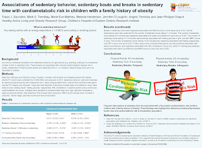
Today’s poster comes from Travis Saunders, who blogs at at Obesity Panacea, and is used with his permission. Click to enlarge...


I’ve tried to focus on visual elements, while minimizing text. Unfortunately this is an epidemiology study with no actual visuals (the results section of the paper itself is 2 pages of adjusted and unadjusted associations... not pretty or easy to display graphically), so I didn’t find it all that easy.

While not easy, Travis has done a good job. I like the pictures at the top left, and on the right hand side for the conclusions. That the left hand pictures are identical freak me out a little, though. Maybe it’s because the boys are having the exact same reaction to diametrically opposite effects! I didn’t change this, though, as it would require combing back through lots of images to find appropriate ones.

The table was the biggest thing that cried out like a lost puppy for change.

  • The indentation scheme violated hierarchy rules. We expect headings to be furthest left, then sub-headings or text to be more to the right.
  • The layout hid comparisons between boys and girls, because it separated similar measures. I moved them side by side so people could direct comparisons more easily.
  • The colours didn’t mesh with anything else.

It turned out that a revision also made it possible for the text to be significantly larger.

Coloured background always worry me, just because I’ve so often seen them in bad lighting conditions. I worry about the top and bottom if this is in dim light. In the revision below, there is a colour, but it’s a very light blue that you might not see depending on your screen settings.

The logo is in the right place (stashed on the right, away from the prime real estate), but too close to the title text. In general, things need a hair more room to breath. I made the Methods, Results and Acknowledgements a hair smaller to create a little more space. I also removed the figure legends, because I was not sure they’re necessary here.

Travis made this in Publisher. I was surprised to see that it didn’t have columns, so I created column grids to make the two columns equal widths.

I made some minor text changes, too.

Here’s the revision I sent to Travis:


That the heading for the first picture is smaller than all the others violates the normal rules for hierachy, but I wasn’t sure what to do about it. Only later did I think of turning the heading into a caption.


Here is the final version Travis went with:

17 October 2013

Archiving posters using figshare

Conference posters have traditionally been ephemera. There have been a few websites that have tried to become a repository for posters, but none have attracted much attention.

figshare might be different. I’ve used this service a few times, but not for posters... yet. But I expect many have already used it for posters.

M. Wilson Sayres at Panda’s Thumb has a nice article about using figshare for posters.

I decided that from now on I will also post pdf files of my posters on FigShare. Now, if you can’t make it to my poster, or didn’t attend the conference, or didn’t even know you were interested in it, you can check out my posters! I think it would be wonderful if conferences started encouraging participants to upload versions of their posters to FigShare, and then compiling them for conference participants to skim prior to attending the meeting.

Another great feature of FigShare is that you can link to relevant material (and update when it becomes available). So for each of these, I linked either to the published version of the paper, or to the arXiv submission.

If you have used figshare for posters, what has your experience been? How many views has it received? Has it led to any follow-ups from other interested scientists?

External links

FigShare: Increasing the impact of scientific posters

10 October 2013

Invitating interaction

Today’s poster comes from Giovanni Dall’Olio. Click to enlarge...


Before I get to the critique and makeover, I want to point out the cool thing that Giovanni did: he invited interaction. Giovanni writes:
One peculiarity of this poster is that it uses an advanced technology to show a live feed of what people are saying about the poster, like in Twitter. It is inspired from a book called Gamestorming by James Macanufo.

This technological trick allowed me to get a lot of useful feedback from the people attending. After the conference, I have collected these comments, and copied them to a table, which you can see here.

But perhaps even more effective is the ultra-simple low tech invitation to interact with this poster. Giovanni left sticky notes with his poster, and created a labelled space so people could comment. And guess what? People used those spaces!


Best example of inviting involvement since this flipbook.

I think this is excellent, because it is the sort of thing that posters can do better than oral presentations. Giovanni created an opportunity for people to communicate with him that did not require his physical presence. When given an opportunity to express an opinion, people often will. It turns the poster into a participatory event rather than another thing to read passively.

Moving on to the poster itself, it is generally clean, but there are a few points for improvement.


This is one of the rare times I don’t mind the boxes, in part because the boxes here are subtle, with light lines, ensuring that the reader goes in rows. Still, the title and bottom don’t need those boxes to clarify the reading order:


I got rid of the boxes entirely, but the spacing between the text didn’t seem to mark the rows out as well, so I tried thin lines between sections in place of the boxes.

Also got rid of the shadowed text in the title and heading. The letterforms are cleaner and easier to read now.


Related posts

How to show a dung beetle running

03 October 2013

Bad poster bingo

Play it at your next conference! Click to enlarge.


At most conferences, the game is not whether you can get a bingo, it’s whether you can do it on a single poster...

External links

Bad presentation bingo